This month of October often creates apprehension amongst investors given its historic track record with the 1929 and 1987 share market crashes. And it was in October 2007 that US shares peaked ahead of 50% plus falls (in most share markets) through the Global Financial Crisis (GFC). From the post-GFC share market lows in March 2009, US shares are up 278% and global shares are up 196% to new record highs and Australian shares are up 92%. After such strong gains it’s natural to wonder whether another major bear market is imminent. Aside from left field events triggering a crash, the key question remains where are we in the investment cycle? This note updates our analysis on this front from earlier this year (see http://bit.ly/2kPIlha) and also provides a comparison to 1987.

Second-longest US cyclical bull market since WW2

The cyclical bull market in US shares is eight and a half years old. It’s the second longest since World War Two and the second strongest in terms of gain. See the next table.
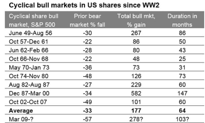
I have applied the definition that a cyclical bull market is a rising trend in shares that ends when shares have a 20% or more fall (ie, a cyclical bear market). Source: Bloomberg, AMP Capital.

At the same time, according to the US National Bureau of Economic Research the current US economic expansion is now 100 months old and compares to an average expansion of 70 months.  The concern is that with the US bull market and economic expansion both old, US shares are vulnerable to another bear market and, by implication, global and Australian shares are, too.

Still in the sweet spot in the investment cycle

First some context. The next chart is a stylised version of the investment cycle – the thick grey line is the economic cycle.
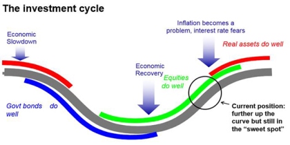
Source: AMP Capital

A typical cyclical bull market in shares has three phases: scepticism – when economic conditions are weak and confidence is poor, but smart investors see value in shares helped by ultra easy monetary conditions; optimism or the “sweet spot” – when profits and growth strengthen and investor scepticism gives way to optimism while monetary policy is still easy; euphoria – when investors become euphoric on strong economic and profit conditions, which pushes shares into clear overvalued territory and excesses appear forcing central banks to become tight, which combines with overvaluation and investors being fully invested to drive a new bear market.

Typically, the bull phase lasts five years. However, “bull markets do not die of old age but of exhaustion” – their length depends on how quickly recovery precedes, excess builds up, inflation rises and extremes of overvaluation and investor euphoria appear.

Our assessment is that we are still in the “sweet spot” phase, albeit more advanced now. Global economic indicators are strong, growth forecasts are being revised up as highlighted by the IMF and this is driving stronger profits. But thanks partly to the slow post GFC recovery, there are still few signs of the sort of excesses that characterise the “euphoria” phase that ultimately leads to the “exhaustion” of the cyclical bull market and the next bear market.

  • There is no overinvestment globally. While the US recovery is further advanced than most, even here business investment and housing investment (excesses in which preceded the tech wreck and GFC, respectively) are around or below long-term averages relative to GDP.

  • Overall private sector debt growth is modest in most countries.

  • After years of below trend growth globally, spare capacity still remains & this (along with technological innovation) has been constraining inflation. Wages growth remains weak and has only just started picking up in the US. Core inflation in major countries ranges between 0.2% in Japan to 1.3% in the US.
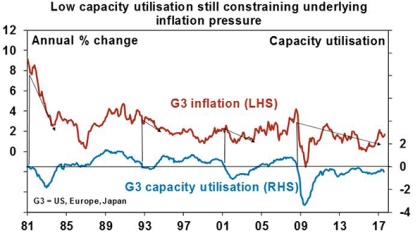

Source: Bloomberg, AMP Capital

  • As a result, global monetary conditions remain easy and without a surge in inflation look likely to remain so. The Fed is continuing to tighten but it’s “gradual” and from a very easy base and other central banks (including the RBA) are on hold. A shift to tight money that brings about a global economic downturn looks a fair way off.

  • Share market valuations are mostly okay. Measured against their own history, shares are no longer cheap. This is particularly so for US shares. But once allowance is made for low inflation and still-low bond yields, shares are fair value to cheap depending on the market (next chart).


Source: Bloomberg, AMP Capital

  • Finally, while short term investor sentiment bullish, long-term measures of positioning are not.  In the US, the huge investor flows into bond funds over the last few years have yet to reverse in favour of shares. In Australia, sentiment towards shares remains low. Still no euphoria here.

It may also be argued that major non-US share markets and Australian shares did have a bear market in both 2011 and 2015-16 so their cyclical bull markets are not old at all.

Overall, we are still not seeing the signs of excess, euphoria and exhaustion that typically come at cyclical economic and share market peaks ahead of recessions and deep bear markets. So barring some sort of external shock, the cyclical bull market in shares looks like it still has further to go.

What to watch?

The key to watch for the next big bear market is for signs of excess – eg, overinvestment in key areas, rapidly-rising inflation, aggressive tightening in monetary policy, clear overvaluation and investor euphoria. This would then set the scene for the next economic downswing and hence a more severe bear market (as opposed to a correction or short-term bear market like we saw in 2015-16). At the moment, it’s hard to see much excess but we do expect US inflation to start rising from here. One risk is that the longer things remain benign, the more investors will expect them to remain benign and this will result in excessive risk taking setting up the scene for a sharp fall in markets. But it’s only lately investors have started to get comfortable. So this may have further to go.

What about comparisons to 1987?

October 19 marks the 30th anniversary of the 1987 share market crash and as always comparisons are being wheeled out. While the bulk of the crash was concentrated in October 1987 (US shares fell 20% on October 19 and Australian shares fell 25% on October 20), US shares fell 34% over three months and Australian shares lost 50% over two months. The causes remain subject to debate – but the key appears to have been a 3% rise in US inflation, a 2% rise in US bond yields and Fed tightening hitting markets after a period of very strong gains. The following tables provide a brief comparison to today.
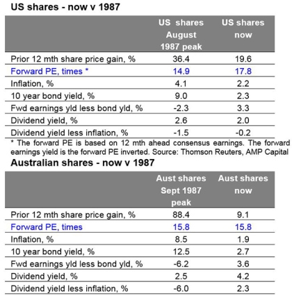
Source: Thomson Reuters, AMP Capital

Compared to 1987, the gains over the past 12 months have been more modest and while forward price to earnings ratios are higher (in the US) or the same, this should be the case given far lower inflation and bond yields and real dividend yields are far more attractive. It’s also noteworthy that share markets had already started to break down before the October 19 1987 crash whereas that has not happened now. As an aside, it’s worth noting that despite the 1987 crash, economic growth was barely impacted and so shares moved higher in 1988 and 1989.

Investment implications

First, corrections should be anticipated – with Trump, North Korea and the Fed being potential triggers – and the fickleness of investor confidence means we can’t rule out another crash like in 1987. But despite this we still appear to be a long way from the peak in the investment cycle.

Second, non-US share markets and economies are less advanced in their cycles and provide opportunities for investors.

Finally, it’s worth noting that several bad years (1987 and 1929) have given Octobers a bad wrap globally. While historically they have been a soft month in Australia (with shares down an average 0.3% since 1985 in October), they have actually been positive in the US (up 1% on average).

Source : AMP Capital 18th October 2017

About the Author

Dr Shane Oliver, Head of Investment Strategy and Economics and Chief Economist at AMP: l is responsible for AMP Capital’s diversified investment funds. He also provides economic forecasts and analysis of key variables and issues affecting, or likely to affect, all asset markets.

Important note: While every care has been taken in the preparation of this article, AMP Capital Investors Limited (ABN 59 001 777 591, AFSL 232497) and AMP Capital Funds Management Limited (ABN 15 159 557 721, AFSL 426455) makes no representations or warranties as to the accuracy or completeness of any statement in it including, without limitation, any forecasts. Past performance is not a reliable indicator of future performance. This article has been prepared for the purpose of providing general information, without taking account of any particular investor’s objectives, financial situation or needs. An investor should, before making any investment decisions, consider the appropriateness of the information in this article, and seek professional advice, having regard to the investor’s objectives, financial situation and needs. This article is solely for the use of the party to whom it is provided.
World energy demand is expected to grow at an annual rate of 1% over the next 25 years. While renewable energy use will continue to grow, fossil fuels will remain the principal energy source. However, natural gas is the fastest growing fossil fuel and coal will continue to lose market share. This represents a significant opportunity for capital expenditure in energy infrastructure as the break-even price of shale oil continues to decline. 

The market keeps expanding 

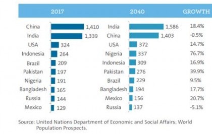
Demand for energy is linked to population size and a country’s stage of economic development. Economic growth leads to an increase in living standards and demand for household necessities which drive the increase in energy use. The world population reached 7.6 billion in 2017. China and India remain the two largest countries in the world with a population of 1.4 billion and 1.3 billion, respectively. 
  The world population is expected to grow by approximately 1% per year, adding 1.6 billion people over the next 23 years and reaching 9.2 billion by 2040. Most of this growth is expected to occur in African countries, with strong additions also in India, Pakistan, Indonesia, and the United States.

Population in top 10 countries (million)

World GDP is expected to grow at an annual rate of approximately 3%, approaching US$150 trillion in 2040 and doubling over the next 25 years. Asia Pacific, including China and India, will account for almost half of the increase (US$37 trillion), followed by North America (US$15 trillion) and Europe (US$11 trillion).

Notwithstanding its robust population growth, Africa is expected to face a limited increase in GDP per capita and therefore to account for only around 5% of the increase in world GDP, but showing the highest compound annual growth rate (CAGR) of 4%.

The continued rise of natural gas 

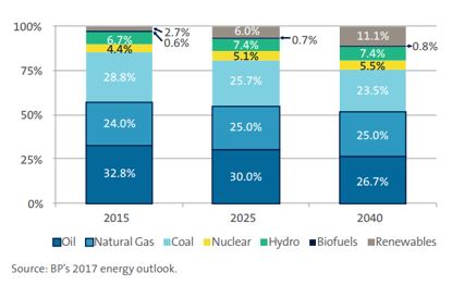
The energy mix has been evolving over recent years. Fossil fuels (oil, natural gas and coal) have been the main source of energy, representing a stable 86% share of the overall energy mix. Oil consumption increased in absolute terms during the 2000-15 period, however its share of the energy mix declined by 5.8% from 38.6% in 2000 to 32.8% in 2015. This decline was offset by an increase in coal, mainly due to increased electricity generation in China. 

Energy mix breakdown

Nuclear power generation has been stable and its share of the energy mix has declined from 6.2% in 2000 to 4.4% in 2015. Renewables, mainly wind, experienced significant growth in the 2000-15 period, increasing their share from 0.5% to 2.7% of global energy use. The energy mix will continue to evolve in the future. Although fossil fuels remain the main source of energy in the global economy, their share of the global energy mix is expected to decline materially in the future. In absolute terms, oil, natural gas and coal will experience annual growth rates of 0.4%, 1.4% and 0.4%, respectively, during the 2015-40 period. 

Natural gas will be the fastest growing fossil fuel with an increasing share of the overall energy mix (from 24.0% in 2015 to 25.0% in 2040), driven by a vast North American shale gas resource base. Meanwhile oil and coal will continue to lose market share falling to 26.7% and 23.5% by 2040, respectively. The declining 2000-15 trend of oil use is expected to continue and coal will be impacted by continued coal-to-gas switching. Fossil fuels’ share of overall global energy use is expected to fall to 75.2% in 2040 from 85.6% in 2015. Renewables will continue to play an increasingly important role in the power generation mix in the future, with their share of the energy mix rising to 11% in 2040.

US Shale drive future production growth of oil and natural gas 

Oil and gas development activity has been evolving significantly since producers outside of OPEC started to use fracking technology to exploit the vast resource potential in North America. 

Technological developments in natural gas are expected to boost production from shale gas and associated gas from shale oil projects. Demand from industrial and electric power markets are expected to drive consumption of US natural gas at an annual growth rate of 0.6% over the next 25 years. However, production is expected to grow much faster (at an annual rate of 1.5%) resulting in an annual surplus of almost 6tcf (trillion cubic feet of natural gas) by 2040, as the US is expected to produce 38tcf and consume 32tcf annually. This amount will be exported through pipelines (e.g. 1.4tcf to Mexico in 2040) and liquefied natural gas (LNG) export terminals (4.4tcf in 2040). Most LNG is currently traded globally under oil price-linked contracts, but LNG produced in the US has the key advantage that domestic prices are less sensitive to global oil prices, which may change pricing dynamics in the future.

Investment opportunity in oil and natural gas storage and transportation

Monopolistic companies that own large and diversified networks offering attractive yields and growth opportunities from future projects represent compelling investment opportunities. Investors should aim to avoid businesses that are highly sensitive to volatility in volumes and/or commodity prices. They should look to identify companies that demonstrate: 

  • Growth – from future projects 

  • Cash flow stability – from fee-based contracts supported by strong regulationYield – derived from compelling shareholder returns 

Such an investment framework enables investors to capture long-term value in the energy infrastructure sector while avoiding short-term volatility in the commodity environment. North American energy infrastructure companies are today uniquely positioned to take advantage of the compelling long-term trends that are currently unfolding in the oil and natural gas supply industries.

To read the full paper click here.

To view the infographic click here.


Source: AMP Capital 12 October 2017


The post-GFC world of record low rates and quantitative easing (QE) created many ‘fashionable’ asset classes that outperformed, such as yield plays and defensive growth stocks including big tech companies like Amazon.

But almost ten years on from the GFC we are now shifting to a new macro environment as central banks like the US Federal Reserve make it clear they are shifting from QE to QT (quantitative tightening). 

There is a danger, however, that investors fail to react to the emergence of this new regime, and they get trapped in crowded ‘overly fashionable’ asset classes and expose their portfolio to significant damage when these assets are sold off. 

To avoid becoming ‘fashion victims’, in our view investors and advisers should be flexible and begin moving to assets that will outperform relatively as the global economy improves and central banks shrink their balance sheets. But they will also need to hedge against an increase in market volatility as the QE cushion is removed.

The good news is the shift to a new investment regime is throwing up some good opportunities, including high-conviction sector ideas like energy and financials.

1. A move to cyclicals 

The first major change investors may consider is altering equities allocations.  
Four years ago, we wanted to chase yield and were focused on REITs and other assets such as high-yield credit. But we have now moved a notch up in the economic cycle and shifted to a phase where global economic growth is becoming more sustainable and synchronised.

Therefore, we see value in increasing allocations to cyclical stocks such as energy, financials, materials, industrials and transportation stocks. We believe real assets such as commodities, metals and energy should also do particularly well, and our Dynamic Markets Fund, including the Active ETF DMKT, has a high – 10 per cent – allocation to commodities.

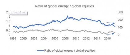
Within cyclicals and commodities, energy is emerging as a ‘high-conviction’ idea as the sector’s fundamentals move from ‘bad’ to ‘less bad’, creating a window of opportunity before most investors catch on.


Source: AMP Capital

The chart above shows a massive disconnect between the relative performance of energy stocks and the rest of the market. Global energy stocks have also lagged a rise in oil prices. No one believes oil prices will stay high because inventories are high. 

But, if you look closely, yes inventories are high, but they are coming down at a rapid pace. US shale oil production, a major cause of oil inventories rising, is clearly declining. New wells are interfering with old ones, and producers need to dig a lot more wells to keep productivity at the same levels. 

We believe oil prices are heading higher. Valuations are very cheap, and because there is a lot of pessimism the market is not seeing energy fundamentals get ‘less bad’. 

2. Financials – winners from shrinking balance sheets

The second major change investors need to adapt to is the impact of Central Banks’ moves to shrink balance sheets on the relative performance of asset classes.


Source: Bloomberg. Past performance is not a reliable indicator of future performance.

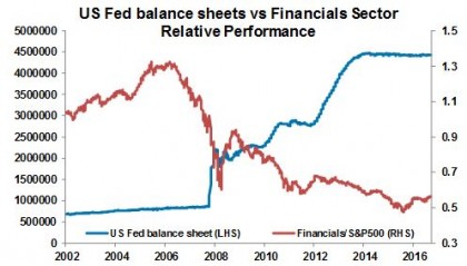
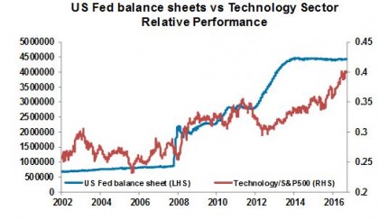
Central banks play a major role in the relative performance of asset classes. The chart above shows that as central banks expanded their balance sheet (the rising blue line) the tech sector (defensive growth) outperformed, but the financial sector suffered.

But as we move from QE to QT and that blue line starts coming down, that relative performance is likely to reverse and banks will perform relatively well.

We have an allocation to European and Japanese banks through ETFs because they were the most negatively affected financials during QE because interest rates there fell. Banks had massive amounts of excess reserves. They put those reserves with central banks and earned negative interest rates, damaging their profitability.

That underperformance means European and Japanese banks should have the most upside in QT.  

3. Hedging volatility and uncertainty

But investors also need to adapt to a likely increase in volatility.


Source: Bloomberg

As you can see in the charts above, QE supressed volatility. Every time news became bad, markets would go up because there was an increased possibility Central Banks would ease again. 

That lack of volatility means markets have become complacent. Markets are not pricing in a lot of uncertainty. US equities, for example, haven’t corrected for the past year and every correction gets bought into. (US equities are the most expensive in the world, so we are underweight.)

With markets not pricing in uncertainty, we have a high, 30 per cent allocation to cash. When the market does price uncertainty and corrects we can use that cash to re-enter.

Because QE dampened volatility, when it ends and central banks shift to QT we will therefore see upward pressure on volatility with a greater risk of corrections and setbacks. Investors should therefore consider hedging their portfolio.

One option is the $US. Given the negative sentiment against the $US – a massive turnaround since the start of the year – the $US has become a great hedge if portfolios correct. Our Dynamic Markets Fund is long $US against short positions in emerging markets currencies. (EM currencies are also a good hedge in case of war.)

Another possible hedge is gold. The probability of a nuclear war with North Korea might be low, but if it does happen the impact will be very high. One asset class that does well in every geopolitical tension or war in the past has been gold. If things escalate from here, gold prices are likely to multiply several fold. The Dynamic Markets Fund also has a 3 per cent allocation to gold as a tail hedge. 

The benefits of multi-asset investing

Loyalty, monogamy and trust are principles of life. But in investing those principles work against you. 

Like fashion, asset classes go in and out of vogue. In 2000 tech stocks were fashionable. In 2007, housing-related stocks in the US were. In 2010 resource stocks. And now yield plays and big tech stocks like Amazon are fashionable. 

But their performance has run its course, and as we move to a new macro environment and investment regime it’s time to look at shifting other assets.

In this complex regime shift, investment strategies like multi-asset investing — the strategy used to manage the Dynamic Markets Fund and DMKT – will thrive. Multi-asset investing gives us the flexibility and scope to change allocations depending on where we are in the cycle. And it also provides us with a disciplined process so we can find value, filter noise and remain objective.

Multi-asset investing allows us to stay away from the crowd and look at opportunities which are underappreciated. It allows us to be ‘fashionable’ but not end up as ‘fashion victims’. Investors and advisers need to follow that lead.

For information on listed investments including Active ETFs and DMKT, register for our upcoming webinar.


Source: AMP Capital 12 October 2017

Author: Nader Naeimi

Nader Naeimi has more than 19 years of experience in Australia’s financial markets, including 16 years at AMP Capital. As the Head of Dynamic Markets, he is responsible for leading the Dynamic Asset Allocation strategy for the Multi-Asset Group, as well as other macro strategies and asset allocations for several AMP Capital funds.


This article has been prepared by AMP Capital Investors Ltd (ABN 59 001 777 591, AFSL 232497) (“AMP Capital”). BetaShares Capital Ltd (ACN 139 566 868, AFSL 341181 (“BetaShares”) is the responsible entity and the issuer of units in the AMP Capital Dynamic Markets Fund (Hedge Fund. AMP Capital is the investment manager of the Fund and has been appointed by the responsible entity to provide investment management and associated services in respect of the Fund. Investors should consider the Product Disclosure Statement (PDS) for the Fund before making any decision regarding the Fund. The PDS contains important information about investing in the Fund and it is important investors read the PDS before making a decision about whether to acquire, continue to hold or dispose of units in the Fund. Neither BetaShares, AMP Capital, nor any other company in the AMP Group guarantees the repayment of capital or the performance of any product or any particular rate of return referred to in this information.

Past performance is not a reliable indicator of future performance.

While every care has been taken in the preparation of this information, BetaShares and AMP Capital make no representation or warranty as to the accuracy or completeness of any statement in it including without limitation, any forecasts. This content has been prepared for the purpose of providing general information, without taking account of any particular investor’s objectives, financial situation or needs. Investors should, before making any investment decisions, consider the appropriateness of this information, and seek professional advice, having regard to their objectives, financial situation and needs.

The AMP Capital Wholesale Australian Property Fund recently bought Stage 1 of the Connect Corporate Centre in Mascot, Sydney, a sleek, brand-new building close to the Sydney CBD valued at $43.6 million. 

What made the building so attractive? For a start, it has a list of blue-chip tenants that will deliver reliable income, but also excellent growth prospects in a transforming area.

It’s characteristics like that that underpin successful commercial property investments. But while there is growing excitement around commercial property’s potential to generate reliable income, particularly for those moving into retirement, few investors understand the real drivers of good commercial property investment. 
There are five features that help investors distinguish good commercial property investment or funds from the bad.

The Connect Corporate Centre in MascotHigh-quality tenants

Quality tenants are the major building block of commercial property. You want access to high-quality tenants with deep pockets and fixed leases – whether government departments, Australian businesses or international companies.

The Connect Corporate Centre in Mascot has a list of high-quality tenants, including the Commonwealth Government, Kone Elevators, global real estate services firm Jones Lang Lasalle, former Qantas credit union Qudos, and international medical device maker, Boston Scientific.

The Fund’s portfolio more broadly consists of household names such as Coles, Woolworths, Leo Burnett, ConocoPhillips and Dulux.

High occupancy rates and a long rent roll

In addition to quality tenants, investors should look for properties and funds that have a high number of tenants. But, importantly, you should look for a high occupancy rate that has been demonstrated right through the cycle. A high occupancy rate allows the property or fund to maintain consistent cash flow streams.

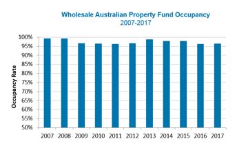
Wholesale Australian Property Fund Occupancy 2007 - 2017

Past performance is not a reliable indicator of future performance.

We have a good track record of renewing tenants and our occupancy rate has been more than 95 per cent for more than 10 years.

Maintaining high occupancy requires excellent management: making sure tenants are well taken care of and that we’re doing all we can to service them.

The right level of debt

Debt often plays a big part in real estate. Debt juices up capital returns – it multiplies both gains and losses. But debt can make income less secure. The right level of debt depends on your investment objectives. 

If you are looking for a defensive, income-generating investment, then you’re likely to prefer an investment with lower levels of debt underpinning more predictable returns.

Because we focus on a solid income profile with a little bit of capital growth, our fund’s policy is to use debt very conservatively. Our gearing levels are typically 0 to 15 per cent. 

Location, location

Just as with residential property, location matters. History shows that assets in major cities tend to benefit from a larger pool of tenants and industries, creating higher rental demand, strong underlying land values and more stable rental returns. 

The property should also be in an area with potential. We believe the Connect Corporate Centre’s location in Mascot provides significant upside to rents. The South Sydney market has been transformed over the past decade and Mascot is establishing itself as an attractive new commercial precinct.

Rents in Mascot at $360sqm to $400sqm are cheap relative to the CBD, which have risen from $600sqm to $1000sqm, but also relative to the likes of Chatswood, Parramatta and Macquarie Park. However, Mascot rents probably won’t stay cheap forever. As the area continues to change and densify, our view is that the market will catch up over time, providing solid capital growth.

Brickworks CentreAnother recent acquisition, the Brickworks Centre, a 15,183 square metre single -level lifestyle centre at Southport on the Gold Coast, has 50 tenants across fresh food markets, eateries, furniture, homewares and boutique retailing.

The Brickworks Centre is located in Southport, a hotspot for population growth on the Gold Coast. Southport has been classified as a priority development area which has led to a surge in development applications including several mooted large-scale apartment projects. The Centre also benefits from the recently constructed light rail, built for the Commonwealth Games.

Scale and diversification

The final factor is diversification. Diversification is crucial to producing quality, stable returns from commercial property. Ideally, you don’t want to be exposed to one property with one tenant. If the tenant leaves and you have difficulty re-leasing, your income could dry up.

Few commercial properties are priced under $1 million, and it can be difficult to get the scale required to achieve a diversified exposure unless you invest in a fund. A fund provides diversification across national property markets, property sectors, buildings and tenants.

The Wholesale Australian Property Fund, as an example, has exposure to NSW, Queensland, Victoria, South Australia and the ACT. We are also diversified across retail, office and industrial sectors, which bring different benefits to a portfolio. Industrial, for example, typically generates more yield. (Broadly, we aim for one-third in retail, a third in office, and another third in industrials.)

We have a mix of 300 tenants in our 22 properties across many sectors such as retail, government, financial and business services and manufacturing and transport. 

Ideally, you don’t want to be overly exposed to one tenant. Our largest tenant, generates less than 5 per cent of the portfolio’s revenue and if we acquire further properties in the fund that percentage will fall. 

Locking in solid returns

There is no doubt that commercial property can deliver solid, stable income streams. But to deliver that stable income stream, investors need to focus on the right properties and right funds.

Our team is extremely selective and for every property we buy, we typically consider and reject another 20. 

If investors can focus on properties and funds that have good quality assets and tenants, then they will lay the platform for solid returns over the medium to long term. 

For more information on the Wholesale Australian Property, listen to our recent webinar.

It’s important to be aware that there are risks associated with investing in the Wholesale Australian Property Fund. Before investing, please read the Product Disclosure State which can be found by visiting our website.


Source: AMP Capital 12 October 2017

Author: Christopher Davitt, Portfolio Manager

Important note: Investors should consider the Product Disclosure Statement (“PDS”) available from AMP Capital Investors Limited (ABN 59 001 777 591, AFSL 232497) (“AMP Capital”) for the Wholesale Australian Property Fund (“Fund”) before making any decision regarding the Fund. The PDS contains important information about investing in the Fund and it is important investors read the PDS before making a decision about whether to acquire, continue to hold or dispose of units in the Fund. National Mutual Funds Management Ltd (ABN 32 006 787 720, AFSL 234652) (“NMFM”) is the responsible entity of the Fund and the issuer of units in the Fund. Neither AMP Capital, NMFM nor any other company in the AMP Group guarantees the repayment of capital or the performance of any product or any particular rate of return referred to in this document. Past performance is not a reliable indicator of future performance.

While every care has been taken in the preparation of this document, AMP Capital makes no representation or warranty as to the accuracy or completeness of any statement in it including without limitation, any forecasts. This document has been prepared for the purpose of providing general information, without taking account of any particular investor’s objectives, financial situation or needs. Investors and their advisers should, before making any investment decisions, consider the appropriateness of the information in this document, and seek professional advice, having regard to the investor’s objectives, financial situation and needs.

A common narrative on the Australian housing market is that it’s in a giant speculative bubble propelled by tax breaks, low interest rates and “liar loans” that have led to massive mortgage stress and that it’s all about to go bust, bringing down the banks and the economy with it. Recent signs of price falls – notably in Sydney – have added interest to such a view.

The trouble is we have been hearing the same for years. Calls for a property crash have been pumped out repeatedly since early last decade. In 2004, The Economist magazine described Australia as “America’s ugly sister” thanks in part to a “borrowing binge” and soaring property prices. At the time, the OECD estimated Australian housing was 51.8% overvalued. Property crash calls were wheeled out repeatedly after the Global Financial Crisis (GFC) with one commentator losing a high-profile bet that prices could fall up to 40% and having to walk to the summit of Mount Kosciuszko as a result. In 2010, a US newspaper, The Philadelphia Trumpet, warned “Pay close attention Australia. Los Angelification (referring to a 40% slump in LA home prices around the GFC) is coming to a city near you.” At the same time, a US fund manager was labelling Australian housing as a “time bomb”. Similar calls were made last year by a hedge fund researcher and a hedge fund: “The Australian property market is on the verge of blowing up on a spectacular scale…The feed-through effects will be immense… the economy will go into recession.” Over the years these crash calls have even made it on to 60 Minutes and Four Corners.

The basic facts on Australian property are well known:
 

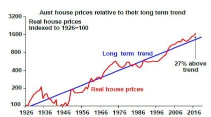
  • It’s expensive relative to income, rents, its long-term trend (see the next chart) and by global standards.

  • Affordability is poor – price to income ratios are very high and it’s a lot harder to save a sufficient deposit.

  • The surge in prices has seen a surge in debt that has taken our household debt to income ratio to the high end of OECD countries, which exposes Australia to financial instability should households decide to cut their level of debt.

Source: ABS, AMP Capital

These things arguably make residential property Australia’s Achilles heel. But as I have learned over the last 15 years, it’s a lot more complicated than the crash calls suggest.

First, it’s dangerous to generalise

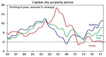
While it’s common to refer to “the Australian property market”, only Sydney and Melbourne have seen sustained and rapid price gains in recent years. On CoreLogic data over the last five years dwelling prices have risen at an average annualised rate of 11.4% per annum (pa) in Sydney and 9.4% pa in Melbourne but prices in Brisbane, Adelaide, Hobart and Canberra have risen by a benign 3 to 5% pa and prices have fallen in Perth and Darwin. Australian cites basically swing around the national average with prices in one or two cities surging for a few years and then underperforming as poor affordability forces demand into other cities. This can be seen in the next chart with Sydney leading the cycle over the last 20 years and Perth lagging.  

Source: CoreLogic, AMP Capital

Second, supply has not kept up with demand

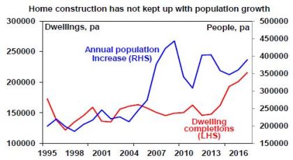
Thanks mostly to an increase in net immigration, population growth since mid-last decade has averaged 368,000 people pa compared to 218,000 pa over the decade to 2005, which requires roughly an extra 55,000 homes per year.

Unfortunately, the supply of dwellings did not keep pace with the surge in population growth (see the next chart) so a massive shortfall built up driving high home prices. Thanks to the recent surge in unit supply this is now being worked off. But there is no broad based oversupply problem.

Source: ABS, AMP Capital

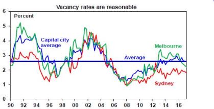
Consistent with this, average capital city vacancy rates are around long-term average levels, are low in Sydney and are falling in Melbourne (helped by surging population growth).

Source: Real Estate Institute of Australia, AMP Capital

Third, lending standards have been improving

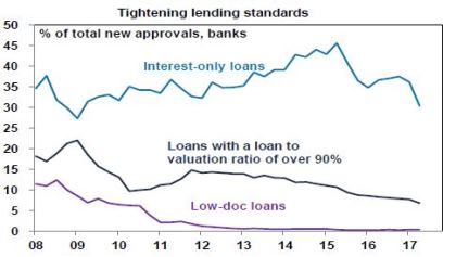
For all the talk about “liar loans”, Australia has not seen anything like the deterioration in lending standards other countries saw prior to the GFC. Interest-only loans had been growing excessively but are not comparable to so-called NINJA (no income, no job, no asset) sub-prime and low-doc loans that surged in the US prior to the GFC. Interest-only and high loan to valuation loans have also been falling lately. And much of the increase in debt has gone to older, wealthier Australians, who are better able to service their loans.

Source: APRA, AMP Capital

Yes, I know various surveys report high levels of mortgage stress. But we heard the same continuously last decade from the Fujitsu Mortgage Stress Survey and yet there was no crash. By contrast, RBA research shows that while getting into the housing market is hard “those who make it are doing ok” and bad debts and arrears are low. Finally, debt interest payments relative to income are running around 30% below 2008 peak levels thanks to low interest rates. Sure, rates will eventually start to rise again but they will need to rise by around 2% to take the debt interest to income ratio back to the 2008 high.

Fourth, the importance of tax breaks is exaggerated

A range of additional factors like tax breaks and foreign buyers have played a role but their importance is often exaggerated relative to the supply shortfall. While there is a case to reduce the capital gains tax discount (to remove a distortion in the tax system), negative gearing has long been a feature of the Australian tax system and if it’s the main driver of home price increases as some claim then what happened in Perth and Darwin? Similarly, foreign buying has been concentrated in certain areas and so cannot explain high prices generally, particularly with foreign buying restricted to new properties.

Finally, the conditions for a crash are not in place

To get a housing crash – say a 20% average fall or more – we probably need much higher unemployment, much higher interest rates and/or a big oversupply. But it’s hard to see these.

  • There is no sign of recession and jobs data remains strong.

  • The RBA is likely to start raising interest rates next year, but it knows households are now more sensitive to higher rates & will move only very gradually – like in the US – and won’t hike by more than it needs to to keep inflation on target.

  • Property oversupply will become a risk if the current construction boom continues for several years but with approvals to build new homes slowing this looks unlikely.

Don’t get me wrong, none of this is to say that excessive house prices and debt levels are not posing a risk for Australia. But it’s a lot more complicated than commonly portrayed.

So where are we now?

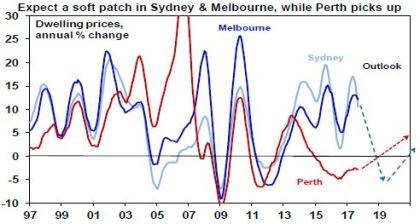
That said, we continue to expect a slowing in the Sydney and Melbourne property markets, with evidence mounting that APRA’s measures to slow lending to investors and interest-only buyers (along with other measures, eg to slow foreign buying) are impacting. This is particularly the case in Sydney where price growth has stalled and auction clearance rates have fallen to near 60%. Expect prices to fall 5-10% (maybe less in Melbourne given strong population growth) over the next two years. This is like what occurred around 2005, 2008-09 & 2012.  

Source: CoreLogic, AMP Capital

By contrast, Perth and Darwin home prices are likely close to the bottom as mining investment is near the bottom. Hobart and increasingly Brisbane and Adelaide are likely to benefit from flow on or “refugee” demand from Sydney and Melbourne having lagged for many years.  

Implications for investors

Housing has a long-term role to play in investment portfolios, but the combination of the strong gains in the last few years in Sydney and Melbourne, vulnerabilities around high household debt levels as official interest rates eventually start to rise and low net rental yields mean investors need to be careful. Sydney and Melbourne are least attractive in the short term. Best to focus on those cities and regional areas that have been left behind and where rental yields are higher.   

Source : AMP Capital 11 October 2017

About the Author

Dr Shane Oliver, Head of Investment Strategy and Economics and Chief Economist at AMP: l is responsible for AMP Capital’s diversified investment funds. He also provides economic forecasts and analysis of key variables and issues affecting, or likely to affect, all asset markets.

Important note: While every care has been taken in the preparation of this article, AMP Capital Investors Limited (ABN 59 001 777 591, AFSL 232497) and AMP Capital Funds Management Limited (ABN 15 159 557 721, AFSL 426455) makes no representations or warranties as to the accuracy or completeness of any statement in it including, without limitation, any forecasts. Past performance is not a reliable indicator of future performance. This article has been prepared for the purpose of providing general information, without taking account of any particular investor’s objectives, financial situation or needs. An investor should, before making any investment decisions, consider the appropriateness of the information in this article, and seek professional advice, having regard to the investor’s objectives, financial situation and needs. This article is solely for the use of the party to whom it is provided.
For some time now, the investment world has been characterised by a search for decent yield paying investments. This “search for yield” actually started last decade but was interrupted by the Global Financial Crisis (GFC) and the Eurozone debt crisis before resuming again in earnest. 

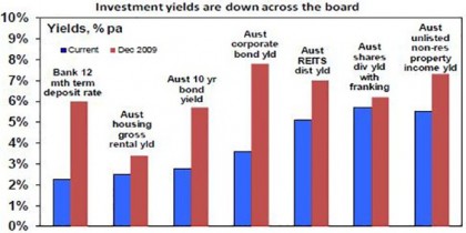
When investment assets are in strong demand from investors, their price goes up relative to the cash flow (eg dividends, interest or rent) they provide pushing their yield down. This is evident in recent times in response to the “search for yield” with yields falling across the board as the next chart shows. 


Source: Bloomberg, REIA, RBA, AMP Capital

But everything goes in cycles. So has the “search for yield” gone too far? Will the US Federal Reserve’s shift to start reducing its bond holdings cause a reversal? 

Drivers of the search for yield

Interest in yield based investing is not new and is in fact a normal part of investing. Particularly when investors are a bit wary about going for growth. In fact, in Japan it’s become pretty much the norm as interest rates have been stuck at zero for years. In the 1950s, yield focussed investing was the norm in the US and Australia. The search for yield also became apparent last decade and played a role in the GFC itself (as investors piled into yield based investments underpinned by “sub-prime” mortgages, oblivious of the risks). There are three main drivers of the “search for yield” in recent years:

  • First, low interest rates and bond yields and the flow on to bank deposit rates due to low inflation and sub-par growth have encouraged investors to search for higher yielding investments. Central banks buying up bonds and displacing investors into other assets have accentuated this.

  • Second, reduced fear of economic meltdown (as the GFC and subsequently the Eurozone public debt crisis subsided) has helped investors feel comfortable in taking on the greater risk that this entails. 

  • Finally, aging populations in developed countries is seeing baby boomers move into pre-retirement and retirement, driving a demand for less volatile investments paying income. Normally, this demand would go to bonds and bank deposits but as their yields are so low some of this demand has gone into other yield paying investments.

Demand for yield from aging populations has further to go as populations age. For example, in Australia the share of the population aged 65 and over is projected to rise from 15% now to 22% by 2061. However, the second driver is cyclical and will reverse next time there is a sustained bout of risk aversion – just as it did in the GFC. 

The first driver is a mix of structural and cyclical influences, though, and it’s probably been the main driver of the search for yield. Bond yields and interest rates have been trending down for 30 years or so and this is structural reflecting a downtrend in inflation, which resulted in a long-term super cycle bull market in bonds. But falls this decade also contain a big cyclical element reflecting the sub-par global growth and deflation seen after the GFC. This accentuated the super cycle bull market in bonds and put the search for yield on steroids. This is where the greatest risk of a reversal in the search for yield trade lies.

The logic of falling yields 

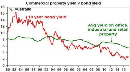
The search for yield is understandable and can be seen in relation to Australian commercial property ie office, retail and industrial property. The next chart shows average commercial property yields and 10-year bond yields. While average commercial property yields have fallen since the early 1980s from an average of 8.3% to around 5.5%, the yield on bonds has crashed. The longer the decline in bond yields has persisted, the more investors have expected it to continue, driving rising demand for higher yielding assets like property.


Source: Bloomberg, AMP Capital

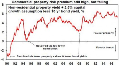
With Australian 10-year bonds yielding 2.8%, it’s little wonder investors might find commercial property on an average yield of around 5.5% more attractive particularly once capital growth of, say, 2.5% pa (ie inflation) for a total return of 8%, is allowed for. The property risk premium – the return potential property provides over bonds – at 5.2% remains high & well above early 1990s and pre-GFC levels that caused problems for property.


Source: Bloomberg, AMP Capital

The same logic applies to investment in assets such as unlisted infrastructure, listed variants of both commercial property and infrastructure, shares and corporate debt.

But are we getting close to a reversal?

Has it gone too far? The greatest risks are around corporate debt where the gap between US investment grade and junk bond yields and US government bond yields has narrowed sharply to around levels that prevailed prior to the tech wreck and again prior to the GFC. But as we saw in the mid-1990s and mid-2000s, spreads can remain low for a while before trouble arises, which is usually when the economy turns down and there is no sign of that just yet. 

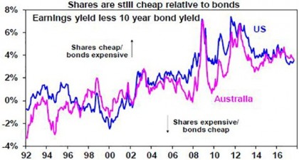
For equities the gap between the forward earnings yield on shares and bond yields has narrowed in recent years. But this gap – which is a guide to the risk premium shares offer over bonds – still remains relatively wide by pre GFC standards.


Source: Thomson Reuters, Bloomberg, AMP Capital

And finally for real assets, using commercial property as a guide, as indicated earlier the risk premium offered by commercial property relative to bonds remains wide, albeit it has narrowed as property yields have fallen and bond yields have risen (a bit). Overall, it’s hard to argue the search for yield has gone too far given how low bond yields still are. That said, corrections like what we saw in shares and corporate debt during 2015-16 are healthy in ensuring this remains the case.

But what about the risk of an upswing in bond yields, particularly with the Fed moving to quantitative tightening? This is the biggest risk and our view is that the super cycle bull market in bonds is over. See “The end of the super cycle bull market in bonds?” which can be found at http://bit.ly/2fLoTNw. There are several reason for this:

  • First, global growth is looking stronger as evident in strong business conditions indicators across most countries. Global growth is improving and becoming more synchronised globally. Nearly 75% of the 45 countries tracked by the OECD are seeing accelerating growth, the highest it’s been since the initial bounce out of the GFC in 2010.

  • Part of the reason for this is that the “muscle memory” from the GFC, which commenced a decade ago, is fading and this is contributing to stronger confidence.

  • The risk of deflation is receding and giving way to the risk of a rise in inflation as capital and labour utilisation is on the rise globally & productivity growth is poor, reflecting: low levels of investment; increasing levels of populist regulation in some countries; and as older workers retire. While the impact of technological innovation (the Amazon effect, artificial intelligence) will keep this gradual there will still be a cycle in inflation and the risks are gradually pointing up.  

  • Reflecting this, central banks are gradually retreating from ultra easy policy. The Fed is the most advanced here as the US economic recovery is further advanced. As a result, the Fed is moving towards allowing its holding of government bonds and mortgage-backed securities to start declining. This will be achieved by the Fed not rolling over (ie not reinvesting) the bonds on its books as they mature so it won’t be as dramatic as actually selling bonds. But its holding of bonds will nevertheless decline and it will be sucking cash out of the US economy. In other words, it will be undertaking “quantitative tightening” to reverse the “quantitative easing” of a few years ago. This is good news and reflects the strength of the US economy much as its commencement of rate hikes did in 2015. Nevertheless, combined with continuing gradual Fed rate hikes, it will likely see a resumption of the upwards pressure on bond yields acting as a gradual dampener on the search for yield.

The upswing in bond yields is likely to be gradual – with periodic spurts higher then fall backs like over the last year – as the Fed will likely be gradual, other central banks including the Reserve Bank of Australia are well behind the Fed in being able to tighten and yield focussed demand from aging populations will act as a constraint. But the trend in bond yields is likely to be up unless there is an unexpected relapse in global growth.

What does it all mean for investors?

There are several implications for investors: expect lower returns from government bonds as yields gradually rise; the search for yield likely has further to go in relation to commercial property and infrastructure but it is likely to wane as bond yields rise; share markets are now more dependent on earnings growth for future gains (and the signs are positive) but cyclical sectors geared to higher earnings will likely be the outperformers and yield plays may be underperformers. That the Fed is moving to start reversing its post-GFC quantitative easing (money printing) is another sign the global economy is getting back to normal. This is good for investors.


Source: AMP Capital 21 September 2017

Author

Dr Shane Oliver, Head of Investment Strategy and Economics and Chief Economist at AMP Capital is responsible for AMP Capital’s diversified investment funds. He also provides economic forecasts and analysis of key variables and issues affecting, or likely to affect, all asset markets.

Important note: While every care has been taken in the preparation of this article, AMP Capital Investors Limited (ABN 59 001 777 591, AFSL 232497) and AMP Capital Funds Management Limited (ABN 15 159 557 721, AFSL 426455) makes no representations or warranties as to the accuracy or completeness of any statement in it including, without limitation, any forecasts. Past performance is not a reliable indicator of future performance. This article has been prepared for the purpose of providing general information, without taking account of any particular investor’s objectives, financial situation or needs. An investor should, before making any investment decisions, consider the appropriateness of the information in this article, and seek professional advice, having regard to the investor’s objectives, financial situation and needs. This article is solely for the use of the party to whom it is provided.
Mining and mining services companies are entering a new paradigm; propelled by advancing technology and artificial intelligence, the segment’s “path to payback” for some of its main capital expenditures is being cut in half in some cases, according to Dermot Ryan, AMP Capital’s Multi Asset Group, direct equities, portfolio manager.

The cyclicality of mining and mining services means companies in the segment predictably go through periods of capital expenditure, followed by periods of operational cash flow, before they’re able to return capital to shareholders and the process starts again.

The “path to payback” for major machinery such as trucks might have been anywhere between three to five years, depending on the company as recent as 2012, Ryan describes during AMP Capital’s recent Capital Insights Forum.

With “quite a few” mining services companies now investing in new technologies – such as automated trucks and other technological developments in the segment improving efficiency – the payback period for a mining truck in the Pilbara, for instance, is now more like 18 months, he says.

Quicker turnarounds on return on investments could help mining services companies in particular progress through cycles quicker, Ryan reckons.

This could mean getting a head start on their global competitors, which can help the local names secure a strong position at the bottom of the cost curve, which could in turn help protect profitability in the event of any pullback in commodity demand, Ryan adds.

The technological efficiencies miners are finding coincides with a resurgence in commodity prices and a return to capex for the sector.

“We’ve noticed the miners have done an incredible job on the cost out, and that’s probably coming to an end now. With the new capex coming through we’ll be looking for miners in general to hold their cost levels and expand their operations. This should be good for some of the listed mining services names,” Ryan notes.

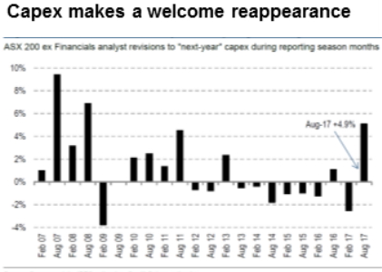
Mining services led the capex this earning season, Angus Nicholson, AMP Capital’s investment strategist notes.

Source: Company Data, IBES Estimates, Credit Suisse Estimates

This is the first time in six years the ASX has seen an increase in capex estimates, Ryan highlights.

The increasing capex provisions have been clustered in energy and commodity-related sectors and in the mining sector reflected much needed replacement capex after a few lean years of investment.

“So these companies have done a marvellous job driving down their unit costs and are now looking to open a new mine or do some drilling to bring on the next stage of production or prove up reserves,” Ryan explains.

Ryan also adds this is a positive sign for the broader economy, which has been dogged by anaemic economic growth. 

“This is a positive trend for the economy and hopefully one that continues,” Ryan concludes.

Investors looking at the mining sector could expect to take advantage of dividends in the sector between now and the next earnings season, Ryan adds.

“The miners have come back from being in a precarious position and are now back to positions where they are able to pay out a large amount of cash flow. These are obviously cyclical dividends but they’ll be paying strong dividends now. And with the commodity uplift coming through the market, it should bode well good for next reporting season as well,” Ryan comments.


Source: AMP Capital 14 September 2017

Author: Dermot Ryan – Direct Equities Portfolio Manager

Important note: While every care has been taken in the preparation of this article, AMP Capital Investors Limited (ABN 59 001 777 591, AFSL 232497) and AMP Capital Funds Management Limited (ABN 15 159 557 721, AFSL 426455) makes no representations or warranties as to the accuracy or completeness of any statement in it including, without limitation, any forecasts. Past performance is not a reliable indicator of future performance. This article has been prepared for the purpose of providing general information, without taking account of any particular investor’s objectives, financial situation or needs. An investor should, before making any investment decisions, consider the appropriateness of the information in this article, and seek professional advice, having regard to the investor’s objectives, financial situation and needs. This article is solely for the use of the party to whom it is provided.
If you look around the world we face unprecedented risks. The Trump Presidency, North Korea’s nuclear ambitions, rising interest rates, and fully valued markets are all spot fires that could engulf portfolios.

These risks can seriously dent investor’s and client’s life savings, and damage their ability to reach important financial goals. The stakes are high.

Savvy investors and advisers are now actively looking to insure against those portfolio risks by using natural hedges like diversification and defensive assets.

Unfortunately, as you can see in the chart below, two big market events in recent memory – the 2000 tech wreck and the 2008 global financial crisis (GFC) – highlighted the limitations of diversification. Bonds were meant to provide a ballast against falling equities. But just when we needed protection the most, both fell at the same time (positive correlation).


click to enlarge

Source: Bloomberg, AMP Capital 2017

It was as if we’d bought insurance for our house and the insurer didn’t pay up.

In this risky market environment, investors and advisers need to look to other forms of portfolio insurance and protection, particularly options. 

Some investors and advisers think options are risky; but options reduce portfolio risk, like insurance on your house. The key is to use them in a dynamic, cost-effective way that minimises performance drag, like only buying insurance only when a fire or storm starts to threaten your house and when insurance premiums are cheap.

A simple contract

Options may seem complex, but basically they are a contract that is sold by an option ‘writer’ to an option ‘holder’. That contract gives the holder the right (but not obligation) to buy or sell a security, such as shares, at an agreed price on or before a specified date.

A ‘call’ option gives the holder the right to buy the underlying security; a ‘put’ option gives the holder the right to sell the underlying security. 

You can limit your trading to options themselves; you don’t have to trade the underlying security themselves. If the underlying shares fall, for example, your put options become more valuable. 

Of course, like any insurance, options cost. The holder must pay the option seller a ‘premium’.

Protection from puts

Put options are a great way to provide protection against market falls.

Buying protective put options are like buying classic insurance – you pay a premium upfront and it pays a positive return when the market declines. 

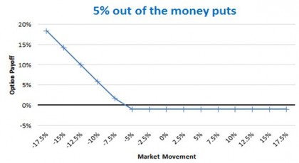
Source: Bloomberg, AMP Capital 2017

The put contract illustrated in the chart above has a strike 5 per cent below the market level. If the market falls 10 per cent, you will get a 6 per cent return. The premium is 1.5 per cent. If the market goes up or falls less than 5 per cent, the option will expire worthless and you lose the premium.

The cost of options

We buy insurance on our house all the time. Can’t you just hold protective puts all the time to protect portfolios?

Unfortunately, because options cost money (the premium you pay to the option seller) they drag on performance. 

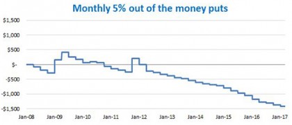
Source: Bloomberg, AMP Capital 2017

In the chart above, you can see the impact on a notional $10,000 of rolling put options at 5 per cent below the money on the S&P500 in the US. There were positive payoffs to the left towards the GFC. But, generally, they are a drag on performance.

Most investors and clients are in accumulation phase. They can take short-term volatility, but they can’t take this drag on performance.

Prudent protection

The good news is that by using options selectively and dynamically, you can get portfolio protection without major performance drag. 

There are three ways to use options cost-effectively.

1. When it’s time

The first method is to only use options when your process or methodology says to reduce risk. For example, AMP Capital uses a Sentiment Score for its dynamic asset allocation (DAA) process, which informs our use of options.

2. When they’re cheap

Another is to buy options when they are cheap. Premiums you pay for options change depending on what the market expects volatility will be. If the market expects higher volatility in the future, people buy more options which pushes their price up. The VIX index measures the implied level of volatility. If the VIX is low, options are cheap.

3. Other markets

Another way to keep costs low is to buy options in countries outside the US. Put options are expensive in the US. Regulations give insurance companies a big incentive to buy put options on market exposures, mostly the S&P500. That pushes up the price of put options. So you should look at other markets, such as Europe and China, to buy protective puts.

Successful protection against Presidential uncertainty

At AMP Capital we successfully use options to protect against worrying market events. 

In September 2016, we were particularly concerned about the US Presidential election triggering a market correction. Our DAA process also showed added risks from record low yields and high valuations in the S&P500.

So for relevant portfolios we entered into a more complex options strategy, called a ‘reverse collar’ to protect against a possible correction.*


Click to enlarge

Source: Bloomberg, AMP Capital 2017

As shown in the chart above, we entered the position in early September, a good time. The market continued to be volatile along with the polling of the candidates. The market fell almost 5 per cent (close to the maximum payoff) and we exited the position when the majority of the potential gain from the strategy had been captured. 

This example also highlights one of our key rules: each option must have pre-defined exit triggers so we crystallise the benefit (or loss) in a disciplined manner.

Incorporating options into strategies and decisions

Portfolios that hold different types of assets, such as multi-asset funds, obviously have an inherent level of risk protection because they have a diversified range of assets. 

But as we’ve seen, diversification doesn’t always deliver portfolio protection, particularly during extreme market events. Sometimes we need to turn to other forms of insurance and protection, such as options.

With the world facing significant geopolitical, economic and market risks, advisers and investors should be considering incorporating options as an insurance strategy. 

Advisers and investors should also be seeking out investment managers who have the skills to use options in a cost-effective and disciplined manner so they can maximise protection and minimise performance drag.


*A reverse collar is selling (short/writing) a put option and buying (long) the call option on the same index. At the same time, to cover any negative market movement and therefore the short put, we sell the same face value of the contracts short, with futures contracts in the S&P500 market.

A reverse collar takes advantage of skew in the US options market. Because of the previously mentioned insurance regulations, puts are more expensive than calls. The skew means we get protection (positive payoff) for the first 5 per cent of the market decline. And we only give up around 2.3 per cent of the upside if the market rallies.

Source: AMP Capital 14 September 2017

Author: Heath Palos, Assistant Portfolio Manager, Multi-Asset Group

Residential property has become the new religion in Australia. The buoyant market, particularly in Sydney and Melbourne where house prices have jumped 75% and 50% respectively in recent years, means residential is constantly talked about and analysed. 

But as more and more baby boomers move into retirement, there is a growing need to seek investments that provide reliable income streams and protect against the unique risks they face such as inflation.

So long as Australians associate ‘property’ with ‘residential’, there is a danger they will ignore commercial property — an asset class that has historically delivered the very stable income, defensive attributes and potential for solid long-term gains that retirees require today. 

More Australians, particularly retirees, therefore, need to start looking beyond residential and understand the 5 key advantages of commercial property.

1. BULK OF RETURNS FROM INCOME

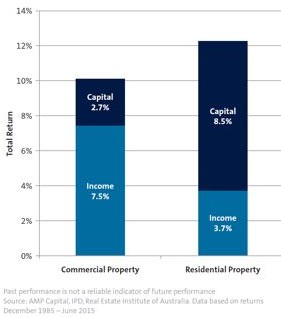
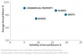
The first advantage of commercial property – retail, industrial and office – is that income underpins commercial property as a great investment. Over the past 30 years, commercial property has delivered total returns of 9 per cent a year. In general, some 2 per cent of the total return has been capital growth. The remainder 7 per cent is income – that’s more than double the standard term deposit rates, albeit with more risk.

By contrast, capital growth dominates residential returns. If we use a three-bedroom home in Sydney or Melbourne as proxy, residential property delivered a greater total return over the past thirty years. However, some 7 per cent of the total residential return was capital growth. That left income at just 3 per cent.

2. A STABLE INCOME SOURCE

Importantly, the income investors earn from commercial property is stable. Tenants, such as businesses and government, lease buildings generally for between 3 to 10 years, sometimes longer. Those long-term leases provide income security.

For example, our Wholesale Australian Property Fund acquired the Codan Building, a campus-style facility in Adelaide suburb of Mawson Lakes for $32.1 million in March this year. The building is fully leased to Codan, an ASX-listed company with a strong track record. The tenant signed a new 15-year lease that started in December 2015 with a 10-year option, and the property provides an initial income return of over 7.5 per cent.
Residential tenants, however, typically sign up for just 6 to 12 months, and in most states they can break that lease with 8 weeks’ notice. 

Within commercial property’s longer leases are fixed escalations in rent – each year rents are increased at an agreed rate of around 3 to 4.5 per cent.

There is also much less chance of a commercial property being damaged by a rogue tenant.

3. PORTFOLIO DIVERSIFICATION

Commercial property also has a low correlation to equities, which makes it relatively stable when markets are volatile.

Firstly, the market prices commercial property funds based on valuations which mean a lot of the day-to-day volatility is smoothed out, both relative to the equities market and even relative to listed property options.

Secondly, in a downturn total property returns can fall hard and dramatically, but the income from commercial property is less impacted in the short term because of legally binding leases. Because they have signed up to long-term rental agreements, the tenant must keep paying their rent each year, regardless of whether their profits rise or fall.

That low correlation to equities, and relative stability, means commercial property provides excellent portfolio diversification and some protection from downside risk.

4. INFLATION HEDGE

Additionally, commercial property is an excellent hedge against inflation, one of the biggest risks for retirees. When inflation accelerates, price rises flow through to higher profits, and in turn that flows through to higher rents and rising land values for commercial property. Historically, commercial property values have tended to rise at rates similar to inflation. That relationship has held for a very long time.

Commercial property therefore provides protection against an unexpected inflation spike. These spikes can have a double-whammy effect on retirees: not only does the price of day-to-day items such as food go up, but core defensive assets such as government bonds suffer.

Commercial property preserves the ‘real’ (after inflation) value of a retiree’s portfolio, allowing the income returns they generate to grow at a similar rate to the cost of living.

5. STRONG RETURN OUTLOOK

And finally, commercial property also offers a solid return outlook. 

We have seen commercial property prices rise in recent years. Investors have been attracted to the sector’s yields in a low interest rate environment. Given our view that interest rates are set to remain low over the medium-term (the next three years or so), we believe that trend has further to run.

Overall we expect commercial property to deliver a 7-8% total return over the medium term, with about 5-6% in income and the remainder in capital growth. That outlook is based on deals we are seeing and executing, where commercial property is being valued and sold on the expectation of a 7 to 8% return.

Looking beyond residential

When we look around at other sources of income and asset classes, the outlook for returns from commercial property is excellent.

Cash and term deposits are no longer adequate sources of income, and The Reserve Bank is unlikely to raise rates aggressively any time soon. Traditional asset classes such as stocks and bonds face the large-scale challenges posed by both slowing global economic growth and historically low interest rates.

Geopolitical tensions, such as North Korea’s missile program and China’s territorial dispute with neighbouring countries over the South China Sea, is instilling further uncertainty in financial markets.

While residential property has been strong, and a crash is unlikely, its growth is now moderating.  Combined, the solid returns, stable income, and low correlation to equities that commercial property offers makes it an extremely attractive investment for Australians, particularly retirees seeking reliable income streams and protection against sequencing and inflation risk.

It’s time for Australian investors, particularly retirees, to look beyond residential and consider investing in commercial property.

Upcoming webinar

Join Christopher Davitt, Fund Manager for the AMP Capital Wholesale Australian Property Fund as he provides an update on the Fund and discusses recent properties that have been purchased. Tuesday 19 September 2017, 2pm-3pm. Register now.

It’s important to be aware that there are risks associated with investing in the Wholesale Australian Property Fund. Before investing, please read the Product Disclosure State which can be found by visiting our website.


Source: AMP Capital 14 September 2017

Author: Christopher Davitt is Fund Manager for the AMP Capital Wholesale Australian Property Fund and Australian Property Fund.

Important note: Investors should consider the Product Disclosure Statement (“PDS”) available from AMP Capital Investors Limited (ABN 59 001 777 591, AFSL 232497) (“AMP Capital”) for the Wholesale Australian Property Fund (“Fund”) before making any decision regarding the Fund. The PDS contains important information about investing in the Fund and it is important investors read the PDS before making a decision about whether to acquire, continue to hold or dispose of units in the Fund. National Mutual Funds Management Ltd (ABN 32 006 787 720, AFSL 234652) (“NMFM”) is the responsible entity of the Fund and the issuer of units in the Fund. Neither AMP Capital, NMFM nor any other company in the AMP Group guarantees the repayment of capital or the performance of any product or any particular rate of return referred to in this document. Past performance is not a reliable indicator of future performance.

While every care has been taken in the preparation of this document, AMP Capital makes no representation or warranty as to the accuracy or completeness of any statement in it including without limitation, any forecasts. This document has been prepared for the purpose of providing general information, without taking account of any particular investor’s objectives, financial situation or needs. Investors and their advisers should, before making any investment decisions, consider the appropriateness of the information in this document, and seek professional advice, having regard to the investor’s objectives, financial situation and needs.

Introduction

As Warren Buffett once said: “There seems to be a perverse human characteristic that makes easy things difficult.” This has particularly been the case with investing where complexity has multiplied with new products, new ways to access various investments, tax changes and new regulations, all with social media adding to the noise. But it’s really quite simple and this can be demonstrated in charts. This note continues our series that began with “Five great charts on investing”, which can be found here and looks at another five great charts – well, one is actually a table – on investing.

Chart #1 Time in versus timing

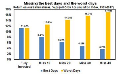
Without a tried and tested asset allocation process, trying to time the market, ie selling in anticipation of falls and buying in anticipation of gains, is very difficult. A good way to demonstrate this is with a comparison of returns if an investor is fully invested in shares versus missing out on the best (or worst) days. The next chart shows that if you were fully invested in Australian shares from January 1995, you would have returned 11.3% per annum (including dividends but not allowing for franking credits, tax and fees). 

Source: Bloomberg, AMP Capital  

If by trying to time the market you avoided the 10 worst days (yellow bars), you would have boosted your return to 12.5% pa. If you avoided the 40 worst days, it would have been boosted to 17% pa. But this is very hard to do and many investors only get out after the bad returns have occurred, just in time to miss some of the best days and so end up damaging their returns. For example, if by trying to time the market you miss the 10 best days (blue bars), the return falls to 8% pa. If you miss the 40 best days, it drops to just 3.7% pa. Hence the old cliché that “it’s time in that matters, not timing”.

Key message: market timing is great if you can get it right, but without a process the risk of getting it wrong is very high and if so it can destroy your returns.

Chart #2 Look less

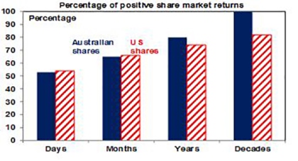
If you look at the daily movements in the share market, they are down almost as much as they are up, with only just over 50% of days seeing positive gains. See the next chart for Australian and US shares. So day by day, it’s pretty much a coin toss as to whether you will get good news or bad news. But if you only look monthly and allow for dividends, the historical experience tells us you will only get bad news around a third of the time. Looking out further on a calendar year basis, data back to 1900 indicates the probability of bad news in the form of a loss slides to just 20% in Australian shares and 26% for US shares. And if you go all the way out to once a decade, since 1900 positive returns have been seen 100% of the time for Australian shares and 82% for US shares. 

Daily and monthly data from 1995, data for years and decades from 1900. Source: Global Financial Data, AMP Capital


Key message: the less you look at your investments, the less you will be disappointed. This matters because the more you are disappointed, the greater the chance of selling at the wrong time.

Chart #3 Risk and return

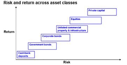
This chart is basic to investing. Each asset class has its own risk (in terms of volatility and risk of loss) and return characteristics. Put simply: the higher the risk of an asset, the higher the return you will likely achieve over the long term and vice versa. The next chart shows a stylised version of this. Starting with cash (and bank deposits), it’s well known that they are very low risk but so is their return potential. Government bonds usually offer higher returns but their value can move around a bit in the short term (although major developed countries have not defaulted on their bonds). Corporate debt has a higher return potential again but a higher risk of default – particularly for junk bonds. Corporate debt is basically a hybrid between equities & government bonds. Unlisted or directly held commercial property and infrastructure offer a higher return again but they come with higher risk and are less liquid and can be less able to be diversified (although this can be remedied by investing via a managed fund). Equities can offer another step up in return but this is because they come with higher risk as they are subject to share market volatility and individual companies can go bankrupt wiping out share holder capital. Beyond this, private equity entails more risk again and so tends to command an even higher return premium. Each step up involves more risk and this is compensated for with more return.


Source: AMP Capital Key message: Investors need to allow for the risk (and liquidity) and return characteristics of each asset. Those who don’t mind short-term risk (and illiquidity in the case of unlisted assets) can take advantage of the higher returns growth assets offer over long periods. The key is that there is no free lunch.

Chart #4 Diversification

But this not the end of the story. The next table shows the best and worst performing asset class in each year over the last 15. 


Best and worst performing major asset class 
 

Year Best Asset Class Worst Asset Class 

2001

Aust listed property

Global equities unhedged

2002

Unlisted infrastructure 

Global equities unhedged

2003

Global listed property 

Global equities unhedged

2004

Global listed property 

Cash

2005

Aust equities Cash

Cash

2006

Global listed property

Aust bonds

2007

Aust equities 

Global listed property

2008

Aust bonds 

Aust listed property

2009

Aust equities 

Unlisted property

2010

Global listed property 

Global equities unhedged

2011

Unlisted infrastructure 

Aust equities

2012

Aust listed property 

Cash

2013

Global equities unhedged 

Australian bonds

2014

Global listed property 

Cash

2015

Unlisted infrastructure 

Cash

2016

Unlisted infrastructure 

Cash


Note: refers to the major asset classes. Source: Thomson Reuters, AMP Capital 

It can be seen that the best performing asset each year can vary dramatically and that last year’s top performer is no guide to the year ahead. For example, those who loaded up on listed property after their strong pre-Global Financial Crisis (GFC) performances were badly hurt as they were amongst the worst performing assets through the GFC. So it makes sense to have a combination of asset classes in your portfolio. This particularly applies to assets that are lowly correlated ie that don’t just move in lock step with each other. For example, global and Australian shares tend to move together during extreme events. But bonds and shares tend to diverge when crises hit – as we saw in the GFC when shares fell sharply but bonds rallied. And so there is a case to have bonds in a portfolio to help stabilise returns.

Key message: diversification is also a bit like the magic of compound interest. Having a well-diversified exposure means your portfolio won’t be as volatile. And this can help you stick to your strategy when the going gets rough.

Chart #5 Residential property has a role 

Chart #1 in the first edition in this Five Charts series highlighted the power of compound interest, with a comparison showing the value of $1 invested in various Australian asset classes back in 1900 and what it would be worth today. Unfortunately, I do not have monthly data for Australian residential property returns back that far but I do have them on an annual basis back to 1926 and this is shown in the next chart starting with a $100 investment. (Commercial property return series only really go back a few decades.)

Source: ABS, REIA, Global Financial Data, AMP Capital  

Again it can be seen that over very long periods the power of compounding works wonders for shares compared to bonds and cash. But it can also be seen to work well for Australian residential property with an average total return (capital growth plus net rental income) of 11% pa, which is similar to that for shares. All of which highlights, along with the diversification benefits of a real asset like property, the case to have it in a well-diversified portfolio along with listed assets like shares, bonds and cash. The key is to allow for the different “risks” experienced by property versus shares. Property prices are less volatile than share prices as they are not traded on share markets and so are not as subject to the whims of investors and movements in their values tend to relate more to movements in the real economy. But residential property takes longer to buy and sell and it’s harder to diversify as you can’t easily have exposure to hundreds or thousands of properties exposed to different sectors and countries like you can with shares. So there are trade-offs between residential property and shares.

Key message: given their long-term returns and diversification benefits, there is a key role for residential property in your investment portfolio (putting aside issues of current valuations).

Source: AMP Capital 11 September 2017 

About the Author

Dr Shane Oliver, Head of Investment Strategy and Economics and Chief Economist at AMP Capital is responsible for AMP Capital’s diversified investment funds. He also provides economic forecasts and analysis of key variables and issues affecting, or likely to affect, all asset markets.

Important note:

While every care has been taken in the preparation of this article, AMP Capital Investors Limited (ABN 59 001 777 591, AFSL 232497) and AMP Capital Funds Management Limited (ABN 15 159 557 721, AFSL 426455) makes no representations or warranties as to the accuracy or completeness of any statement in it including, without limitation, any forecasts. Past performance is not a reliable indicator of future performance. This article has been prepared for the purpose of providing general information, without taking account of any particular investor’s objectives, financial situation or needs. An investor should, before making any investment decisions, consider the appropriateness of the information in this article, and seek professional advice, having regard to the investor’s objectives, financial situation and needs. This article is solely for the use of the party to whom it is provided.